Support my work on Patreon

If you like my work, please consider to help my growing family with a little financial support through my Patreon creator page.


Alternatively, you can leave a one-time donation via PayPal using the Donate button below.

Total Pageviews

Wednesday, September 24, 2014

Tutorial: using the "Curves" tool in PhotoFlow

The curves tool is probably the "swiss army knife" of photo retouching; combined with grayscale masks that limit its action only to portion of the image, it can probably cover 90% of your editing needs.

There are lots of nice tutorials and explanations about curves and their use, therefore I will not repeat here things that others have explained at length and much better than I would. A very good resource is Patrick David's tutorial on the subject, which you can access here.

Here I will mostly focus on how to use curves in photoflow, and on how to create, modify and delete control points.

Photoflow's curves undisclosed

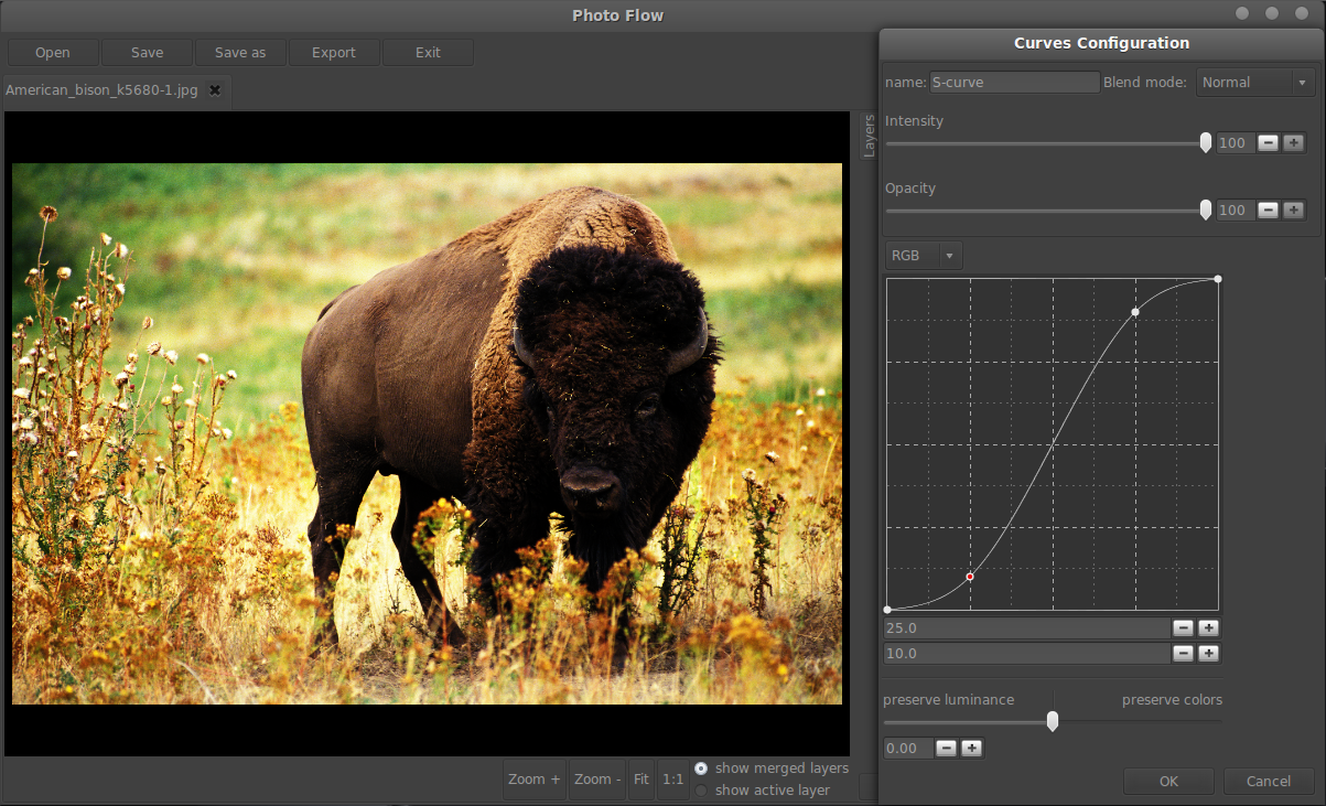
Let's start as usual by opening an existing image (in this example, the "american bison"): click on the "Open" button near the top-left corner of the main window and choose a file in the dialog that pops up.

Now that we have an image at hand, let's see how to add a "Curves" adjustment. First of all, click on the "+" button at the bottom of the layers widget, switch to the "color" tab in the tool selection dialog and select the "Curves" tool from the list (see below).


Once you click on the "Ok" button, a layer is added on top of the one called "background" and a the configuration dialog for the curves tool is opened.

The top part of the configuration dialog contains a text box where you can define a custom name for the corresponding layer, a selector that lets you change the blending mode of the layer, and two sliders that allow to control the "strength" of the effect (I'll explain the difference between "Intensity" and "Opacity" a bit later).
Below the "strength" sliders you can see the graph where you can edit the curves, above which you can see a selector where you can specify on which channel the curve should be applied. When editing RGB images, you can apply  the curve to all three RGB channels simultaneously (choosing the "RGB" option like in the image below) or a different curve for R, G and B (by choosing the corresponding option in the channel selector). If you are familiar with GIMP, "RGB" here corresponds to "Value" in GIMP.


In this example we will increase the overall contrast of the image by applying an S-shaped curve to all three RGB channels simultaneously. To create the first control point, click with your mouse  at around 3/4 of the graph and drag the point upwards. You can also specify the position of the newly created control point by using the two numerical values below the curve: the first one sets the input value and the second one the output. I'll set the point to in=75 out=90.
Now we will create a second control point by clicking on the curve at around 1/4 of the graph and then dragging the point downwards (see below).


I've choosen to set the second point to in=25 out=10 so that the curve crosses the middle of the graph.
The result is shown below: the increase in contrast is way too strong, so we would need some way to "reduce" the effect until it looks ok... this is where the intensity and opacity sliders enter the game. If you move your mouse over the text in the image caption, you can see a comparison between the results obtained with 50% intensity, 50% opacity and a "weaker" S-curve.


As you can see, setting the intensity to 50% is equivalent to dragging the control points halfway from the diagonal line (but much easier). In other words, lowering the intensity modifies the curve so that it gets closer to the diagonal in a way proportional to the intensity itself (the curve coincides with the diagonal when the intensity is set to 0%). On the other hand, the opacity value controls how the modified image should be mixed with the input one, according to the choosen alpha blending mode.
In this specific case, the blending mode is set to "Normal" and therefore the intensity and opacity have the same effect. In general however, the intensity acts on the pixel data BEFORE the alpha blending step, while the opacity controls the strength of the blending step itself.

Control points can also be added to the curve by directly clicking in the preview area while holding down the Ctrl-key. When you do that, the input image of the curves layer gets sampled in a small region around the clicked point and a new control point is automatically added at the right place along the curve.

Last but not least, control points can be removed by clicking on them with the right mouse button.

Curves, color and luminance

One of the bad side effects of any contrast adjustment applied to RGB images is that saturated colors tend to become even more saturated, frequently to the point where they look quite unnatural. The final image in this tutorial is not an exception to this rule, particularly in the yellow tints. However, photoflow provides a mechanism to migitage this effect.
Several color adjustment tools in photoflow provide a slider that lets you control how much of the input color (or luminance) information is preserved in the modified image. Mathematically, this is obtained  by making a transformation in an HSL-like (Hue, Saturation, Luminance) colorspace and then combining the luminance of the modified image with the hue and saturation of the input one (or vice-versa if you want to preserve the luminance of the input image). The original formulas used in photoflow can be found here.

In the specific case of the curves tool, this slider can be found at the bottom of the configuration dialog. By default, the cursor is in the middle of the slider and no transformation into HSL colorspace is perfromed. If you move the cursor to the right (towards the "preserve luminance" label) the colors of the input image will be preserved more and more, giving in our case an image with increased contrast but natural colors. If you move it to the left (towards the "preserve luminance" label) the luminance of the input image will be preserved, giving in our case the opposite effect (the original contrast but more saturated colors).

The images below show another example of over-saturated colors after a contrast enahncement, and the results obtained when preserving either the colors or the luminance of the original image. In each case, you can move your mouse over the image to see the original.

Contrast increased via S-curve (mouseover for original).

Contrast increased via S-curve, colors preserved (mouseover for original).

Contrast increased via S-curve, luminance preserved (mouseover for original).


It's time to finish this long tutorial... as you have seen, the curves tool in photoflow is rather powerful, and offers some options rarely found in other projects (for example, the possibility to set control points by numbers, or the additional colors/luminance control). It is probably the tool that I have implemented in the most complete way so far, and I'm still working to improve it further. It is also the tool I'm using more often for my own edits...

Friday, September 19, 2014

Tutorial: creating and using luminosity masks with photoflow (inspired from Patrick David's blog)

This tutorial describes how to create and use luminosity masks with photoflow. Before starting, I would like to clearly state that the technique presented here is not my invention, but is directly inspired from Pat David's blog posts here and here, which in turn refer to the original Tony Kuyper's Luminosity Masks Tutorial.

However, compared to the Photoshop and GIMP versions the technique presented here is more flexible, for two main reasons:
  1. the luminosity mask will be associated to a group layer; therefore, the mask will be applied to any combination of filters and adjustments (curves, toning, sharpening, etc...) that you might include in the group
  2. we will create the luminosity mask "on-the-fly" by simply applying a curves adjustment to a greyscale copy of the input image. This way the mask will remain fully configurable and you will be able to immediately see the effect of a change in the selected luminosity range in the preview window
You will need a very recent version of photoflow in order to follow the steps described here, due to some bugs that I just identified and fixed.

The steps described in the tutorial will at the end be saved into a preset so that they can be re-applied automatically to a different image. Again, photoflow presets have a certain advantage over GIMP scripts, as they simply re-create the original filter stack: as photoflow's filters are fully non-destructive, you will have the possibility to further tweak the settings (for example the curves adjustemt that defines the luminosity range) once the preset is loaded.

This time I decided to start from the end, and show the result of this tutorial (basically a mid-tones luminosity mask + strong contrast adjustment) to the same image shown at the beginning of Pat David's post. Here it is (move the mouse pointer over the image to see the original):

Brorfelde landscape by Stig Nygaard (cb)
After applying the steps of this tutorial (mouse over to see the original).


Now let's see how to achieve that result, step by step...
Part of the steps described here have been already covered in detail in the Orton Effect tutorial(), therefore it might be a good idea to read it before starting or in case something is not clear.

Step 1: preparing the input and group layers

First of all, open photoflow and load a new image on which you would like to work.
Then, add a buffer layer above the background layer and call it "mid tones input", as shown below:


You will see that many of my tutorials start by a buffer layer. The reason for that is explained in detail in the Orton Effect tutorial, so I suggest you to have a look there if you are not yet familiar with buffer layers and their use. Here I will just remind that they are a convenient way to mark a specific point in the processing flow. As they have a negligible impact in terms of memory and cpu usage, you can add as many of them as you like during editing.

Next, add a group layer above the buffer, and call it "Mid Tones". Our mid-tones mask is going to be associated to this group layer: whatever filter will be added inside the group layer, it's impact on the image will be "modulated" by the group's mid-tones mask.
Your photoflow window should look something like this:


Step 2: creating the mid-tones mask

At this point we can start creating the mid-tones opacity mask associated to the group layer. To start editing the mask, double-click on the gradient at the right end of the group layer. A new tab will appear in the layer list widget, where we will insert the layers needed to build the mask. Click on the "+" button at the bottom of the layers widget, switch to the "misc" tab of the tool slection dialog and select the line called "Clone layer". Your photoflow windows should look something like this:


After clicking "OK", the configuration dialog of the newly created "clone layer" will pop-up. Here we have to choose the input layer to be cloned and the input source channel. Select "mid tones input" as the layer name and "RGB" as the source channel. This will instruct the clone layer to use the pixels of the background image (or actually of anything below the "mid tones input" buffer layer) as source data; since the input is in RGB format and the target output is grayscale, the pixels will be internally converted using the same formula as GIMP's "desaturate" tool with the "luminosity" option. The clone configuration dialog should look similar to this:


Let me spend few more words on what "layer cloning" exactly means here. You might think of it as a sort of "smart copy": the clone layer "gets" the data of the source layer defined in the configuration dialog and sends them to its output. In practice it is like making a copy-and-paste of the source layer, except that the copy is done "on-the-fly" ad that there is actually no additional memory allocation involved... if the input image is modified, the copy will immediately and automatically reflect this change.

Well, I think it is getting way too technical... let's go back to the main subject!

Our mask for the moment directly reflects the luminosity of the image; instead, it should be white in the mid of the tonal range and black at the extremes. To obtain that, we are going to apply a curves adjustment to the mask. But before doing that, let's see how the mask can be visualized in the preview window, so that we can easily and immediately check the adjustments we are going to apply... with the clone layer selected, click on the "show active layer" toggle button-right of the preview area. The mask will be shown in red color on top of the edited image: the black areas in the mask will appear red in the preview, while the white areas will be transparent and the edited image will be fully visible. Here is how the photoflow preview should look like when showing the luminosity mask:


Now that we have a way to judge the effect of the adjustments applied to the mask, let's add a curves adjustment on top of the clone layer. Click as usual on the "+" button at the bottom of the layers widget, switch to the "color" tab in the tool selection dialog and select the "Curves" tool from the list (see below).


After clicking "OK", the curver layer is added and the corresponding configuration dialog is opened. At this point we can modify the grayscale values of the mask: create a control point in the middle of the curve and drag it to the top, then grab the rightmost control point and bring it to the bottom. Then bring the two extreme control points a bit to the right and left respectively, to further reduce the mid-tones range. You can also set the coordinates of the control points numerically once they are highlighted; in this case I have choosen the following values: (12.5,0) (50,100) (87.5,0). You should obtain a result similar to this screenshot:


The steps I have just described actually show another peculiar feature of photoflow: layer masks are handled as sub-images (or images-in-the-image) and can be edited the same way as the main image. You can non-destructively apply filters (curves, gaussian blurs, etc...) to the masks, you can group filters, and much more.


We are almost done now with the mask. The last step is to apply a bit of gaussian blur to the mask, so that small details in the dark and light areas of the image will not be "flattened" too much. Add a gaussian blur filter on top of the curves layer (you will find it in the "details" tab of the tool selection dialog, as shown below) and set the radius (equivalent to the "sigma" of the gaussian kernel) to something between 3 and 5 pixels (you can adjust it to taste).


Now you can switch back to the "Layers" tab in the layers widget and switch the preview mode to "show merged layers" with the corresponding toggle button at the bottom of the preview area.


Step 3: increasing the mid-tones contrast

Up to now, the preview image looks exactly the same as the original one, despite all our efforts to create a nice mask to selectively edit the mid tones... don't worry, it's not a mistake and we are going to change that now. What we have at the moment is an empty group layer with an associate opacity mask that selects the mid-tones of the image. As I said at the beginning, this means that any filter which is added to this group will prevalently act on the mid-tones, leaving the shadows and highlights unchanged. To verify that, let's add a simple brightness/contrast filter into the group: to do that, you have to first select the empty line below the group layer and then click on the "+" button at the bottom of the layers widget. The "brightness/contrast" filter can be found in the "color" tab of the tool selection dialog (like for the "Curves" tool). This is how your photoflow windows should look like at this point:


Finally, increase the contrast from zero to about 0.4 and check the preview window while you do that: the contrast increase will be maximal in the mid-tones region, while shadows and highlights will not be affected. You can toggle the visibility of the brightness/contrast layer on and off to compare with the original image.


That's it! Of course, you can replace the brightness/contrast tool with something else, like a curves adjustment (or a combination of several filters, as long as they are all inside the "Mid Tones" group), and their effect will be limited to mid tones as well.


Step 4: saving the mask as a preset

It would be a pity to be obliged to redo all this steps each time we want to apply this technique to an image. Fortunately, photoflow allows to save a group of layers as a preset, which can be reloaded and applied to other images.
Since what we are interested in is the masking technique itself, and not the actual contrast adjustment that we have just applied, I suggest you to drag the brightness/contrast layer outside of the group (either above it, or below the buffer layer) before saving the preset (see screenshot below).


Then, select both the "Mid Tones" group layer and the "mid tones input" buffer layer and then click on the "Save" button at the bottom/right of the main window. A file chooser dialog will appear in which you can specify the location and file name for your preset, which should end with extension ".pfp". Choose whatever you prefer and click "OK" to save the file. Now you will be able to apply the mid-tones masking technique to any other image by simply reloading the preset via the "Load" button at the bottom of the layers widget!

Bottom line: the effect of blurring the mask

Here is one more example showing how the blurring of the mid-tone mask affects the small details in the shadows and highlights (here more evident in the shadows). The image below is obtained with a blurred mask; is you move the mouse pointer over the image, the version without blur will be shown instead. Look at how the details in the dark parts of the bison's fur and skin are rendered in the two cases...


Tuesday, September 16, 2014

Tutorial: how to match the Nikon in-camera jpeg colors with photoflow

This tutorial will show you how to achieve a perfect color matching between the photoflow RAW processing and the in-camera Jpeg when reading Nikon NEF files. Or at least for D300 files, as this is the only camera I've carefully tested for the moment... However, I'm 90% sure that the method will give the same good results for other Nikon DSLR as well.

First of all, you will need to open a NEF file and add a RAW developer layer in order to process it; the details of how to do that can be found in my previous blog post, as well as the explanation of all the controls found in the RAW developer configuration dialog.

By defaul, photoflow interprets the linear RGB data of the RAW image using the standard Adobe color matrices, which give good and "correct" colors (possibly more "correct" than those produce by the camera).
Below I have put a first comparison between the result of Capture NX with the default in-camera settings, and photoflow with the in-camera WB and exposure and Adobe matrices for color rendering. Move your mouse pointer inside the image to see the photoflow version.


As you can see, the photoflow version lacks the "pop" of the in-camera image. Don't worry, we are going to fix that in few simple steps!


Step 1: extract the camera profiles from Capture NX(2) or View NX2

The final colors of the processed RAW image are determined by the input color profile. This profile, when combined with a suitable working profile, allows to "transforms" the linear RGB values from the camera into other RGB values that have a "well-defined" and camera-independent colorimeteric meaning.
Therefore, getting the "right colors" is mostly a question of using the "right camera profile". Fortunately for us, the Nikon software generates such profiles as temporary files whenever you open a RAW file for editing, so that w can save them for later use. There are several tutorials on the net that explain how to find those profiles on the hard drive; one good resource can be found on RawPedia.

One important detail to be kept in mind when creating the camera profiles using the Nikon software is that you need to switch off all enhancements, in particular the D-lightning if it was enabled in camera. Each time you do some changes that impact the camera color profile used internally by Capture/View NX, a new file will be created in the temporary folder; you should generally take the most recent one.

Different "Picture Control" settings will translate into different camera profiles: you can therefore create one profile for each of the settings (standard, portrait, landscape, neutral, etc.), and you will be able to mimic each of them in photoflow.


Step 2: load the profile in photoflow

Since we want to match the Jpeg image produced straight out of the camera, we should leave the WB mode to "CAMERA" and the exposure compensation to "0". Of course you are free to change those parameter if you are not satisfied with the result, but then your processing will obviously deviate from the in-camera image...

We now have to tell photoflow that it should use the Nikon camera profile to interpret the RAW image colors. To do that, you first have to open the RAW developer configuration dialog by double-clicking on the corresponding layer. Then go to the "Output" tab and change the "Color conversion mode" to "ICC". At this point, the preview window will most probably show a quite dark image: that's normal, since the camera profile is now undefined. Click on the "Open" button at the right of the "camera profile name" text entry, and select the Nikon profile in the file chooser dialog that will pop-up. At this the colors in the preview image should have changed, but still the image should appear very dark. This is because the Nikon color profile expects the RAW RGB values to be encoded with an sRGB tone curve instead of a linear one. The RAW developer dialog provides a drop-down selector, labelled "RAW gamma", which allows to choose the type of tone curve to be applied to the RAW data; three choices are provided:
1. "None": in this case the linear RAW data is not modified
2. "sRGB": an sRGB tone curve is applied to the linear RAW data
3. "Custom": a custom gamma curve is applied to the linear RAW data; you can set the slope of the gamma curve via the "Gamma exponent" value below the "RAW gamma" selector

As you might have already guessed, for Nikon profiles you have to choose option #2. Your RAW developer configuration dialog should look similar to this:


Et voila'! Your picture should now look exactly the same as the in-camera jpeg, at least in terms of colors. The image below shows a comparison between the result of Capture NX with the default in-camera settings and of photoflow using the Nikon profile and the sRGB tone curve (move your mouse pointer inside the image to see the photoflow version).
In fact, at this level the two pictures are indistinguishable!


Some soubtle difference appears if we look into the image at 100% scale. Below is a crop of the previous image, as usual you have to move the mouse into the image to see the photoflow version. The Capture NX version look a bit softer, even if I intentionally turned off any noise reduction. It seems that the open source Amaze demosaicing that is used by default in photoflow does really a good job in getting all the details out of the sensor data!

Now you can play with your preferred pictures using the nice and brigth original Nikon colors as a starting point...

Saturday, September 13, 2014

Tutorial: how to process a RAW image in photoflow

This tutorial will teach the basics of loading and processing RAW digital images in photoflow.

Photoflow can curently open any RAW image in Bayer format that is supported by LibRAW 0.6.0. Work is ongoing to port the RAW loading backend of RawTherapee into photoflow, but the code is not yet fully functional. Once this will be finished, support for other RAW formats (like X-trans) will be hopefully included quite quicly...

Although the RAW processing in photoflow is still under development, it provides already a quite complete set of features: white balance can be adjusted starting from a neutral image area or by specifying a target color tone, you can choose between Amaze and IGV demosaicing algorithms, and it gives the possibility to switch between the standard dcraw matrices and a custom camera profile for the final conversion to the working color space.

To simplify your life when processing several images taken under similar shooting conditions, the RAW processing parameters for one image can be saved as a preset and then recalled and applied to the rest of the images of the same shooting session. This allows to speed-up your editing work and also to keep a consistent post-prcessing across all the images of the same sequence. You will find more details about that at the end of the tutorial.

The RAW processing in photoflow is similar to that of other image editors, and probably not as feature-rich yet, however the code is growing quite quickly. Since most of the algorithms are a port of the original RawTherapee code, one can expect a similar output quality once all features will be implemented.

Step 1: How to open a RAW image file


Opening an existing RAW image is very simple. You can either do that by passing the file name as a parameter when invoking photoflow from the command line, or by cliking on the "Open" button and selecting a RAW image from the file selector dialog.

The operation of opening the RAW file will most probably take several seconds, as the program will first decode the whole image into memory, save the decoded data into a disk buffer, and perform a first demosaicing to initialize the scaled-down versions of the full-res image for faster zooming.
Once the loading is finished, you should see a very dark and dull version of the RAW image: this is because no post-processing is applied at this stage, and therefore the program shows you the original RGB values in linear colorspace.

Step 2: Process the RAW file


In order to process the RAW image (white balance, demosaicing, exposure comensation, etc...) you need to add a "RAW Developer" layer on top of "RAW loader". To do that, click on the "+" button at the bottom of the layers list, select the "raw" tab in the tool selection dialog, and select the "RAW developer" tool. Your photoflow window should look something like this:


Click "OK" to add the RAW developer layer. At this point the image should look much more familiar, with colors that are at least reasonable and a correct brightness.
By default, the RAW processor applies the camera white balance and the Adobe matrices for rendering the colors, producing an output image in the sRGB colorspace. However, all those parameters can be changed and tweaked in real time.


The controls of the RAW developer are organized in four tabs: "White balance", "Exposure", "Demosaicing" and "Output"; let's see each of them in detail...

White balance tab

photoflow currently supports three white balance (WB) modes:
  • "CAMERA": this is the white balance setting used by the camera when shooting the image. Three sliders allow to move the red, green and blue multipliers away from their in-camera values, allowing a precise fine-tuning of the result.
     
  • "Spot": when this mode is selected, you can click with the mouse on a gray or neutral area in the preview image to determine the correct white balance. Three sliders let you tweak the WB multipliers by hand if you feel that some further fine tuning is needed.
  •  "Color spot": this mode works similarly to the "Spot" one, except that you can specify the target color of the image area on which the mouse click occours. Three boxes allow to define the target color in terms of Lab values. Presently only the "a" and "b" values of the target color are used to adjust the white balance. Again, three sliders let you tweak the WB multipliers by hand if you feel that some further fine tuning is needed. Here is how the color spot controls look like:

The "Color spot" mode is particularly useful to quickly find a good starting point whenever you are faced with a shot without a clear neutral region and/or taken under uncertain light conditions. For example, I often use it for portrait shots taken under shadow: in this case, just select a target skin tone (for example "a=8, b=9" might be a good starting point, but you are free to experiment depending on the actual skin tone of your model...) and click on some good skin area (the forehead, neck, etc...). This mode might also be useful if some area of your picture has a well-defined but not neutral color.

Other WB modes like "daylight", "thungsten", "flash" etc... are planned for one of the next photoflow versions.

Exposure tab

This tab contains one single slider which allows to change the overall exposure of the image. The values of the slider are in ISO units: a value of +1 equals one stop of overexposure.

Demosaicing tab


In this tab you can choose the demosacing method applied to the RAW image, and tune the post-demosaicing false color suppression.
The demosaicing algorithms and post-processing are directly derived from those found in RawTherapee.
Three methods are proposed:
  • "Amaze": this method allows to preserve the highest amount of detail in the image, and is better suited for low-ISO shots that are not too noisy.
  • "IGV": this method provides a pleasing "grainy" result when applied to high-ISO, noisy images and might be better than Amaze, in particular if you plan to apply some noise reduction filter to the image.
  • "Fast": this is a low-quality, high-speed method that is used internally to produce the scaled-down versions of the full image for fast  zooming. It might be useful to speed-up the image processing when initially tweaking the image at 100% zoom level, but it should never be used for the final image editing.

"False color suppression steps" slider (from RawPedia): sets the number of median filter passes applied to suppress demosaicing artifacts when applying the demosaicing algorithm. False colors (speckles) could be introduced during the demosaicing phase where very fine detail is resolved. False color suppression is similar to color smoothing. The luminance channel is not affected by this suppression.
The default value of two steps should generally give good results.

Output tab

In this tab you can define how the RGB values of the demosaiced image should be interpreted and converted to the working colorspace of your choice. Three methods are currently proposed:

  • MATRIX: the colors are rendered using the color matrices from dcraw. From RawPedia: "A color matrix is a matrix of 3x3 constant values which is multiplied with the camera's native RGB colors to convert them to colors which are as natural as possible. A color matrix works best (i.e. provides more accurate colors) when the white balance is close to what the matrix was calibrated for. The camera standard matrix is calibrated for D65, i.e. 6500K. Do not worry if the white balance is quite far off from that though, color will be reasonably accurate anyway."


  •  ICC: in this case you have to specify a custom input profile for your camera. Camera input profiles can come from different sources (custom-made from an IT8 target, bundled in some third-party software, freely provided by other users, etc...). In the next tutorial I will show how to use the Nikon camera profiles that are automatically generated by Capture/View NX in order to precisely reproduce the Nikon colors in photoflow. Custom camera profiles might need some pre-processing of the image data before being applied: photoflow allows to apply an sRGB or custom gamma curve to the image data; use this options if your camera profile produces very dark images without any pre-processing. You might need some experimentation to find the good settings: for example, Nikon profiles from Capture/View NX require an sRGB tone curve. If you find a good setting for a given camera/profile combination I'll be glad to add that to the documetation.
  • NONE: this choice completely disables the color management, and gives access to the uncorrected linear RGB data after demosaicing and WB. You can apply an RGB or custom gamma tone curve to give the image a "natural" brightness.

Output profile selector: this selector lets you choose the working colorspace into which the image data should be converted. In addition to the standard sRGB colorspace, the AdobeRGB and ProPhoto profiles are provided if you need something covering a wider gamut.
If you choose the "custom" value then you will have to specify the file name of the ICC profile in the "output profile name" text box at the bottom of the dialog.


Here is how a processed image looks like:


Step 3: Saving the RAW processing parameters into a preset


If you have a series of images that have been taken under similar shooting conditions, and which should have a similar "look & feel" for artistic "consistency" reasons, you can automatize part of the work by making use of photoflow's ability to save and reload "presets". The procedure is very simple:
  1. choose one image and tweak all the RAW processing parameters until you are satisfied.
  2. select the "RAW developer" layer and click on the "Save" button below the layers list widget (at the bottom-right of the photoflow's window)
  3. choose an appropriate file name and location for your preset; the preset file name must be given a ".pfp" extension
  4. save your current image as a ".pfi" file (this time you have to use the "Save" button above the preview area, close to the top-left corner of photoflow's window) and close it
  5. open the next RAW image file to be edited
  6. click on the "Load" button below the layers list widget (at the bottom-right of the photoflow's window)
  7. choose the preset file you just created at step 3
The RAW processing parameters saved in the preset should now be applied to the newly opened RAW image... you can repeat that for all the images in your sequence, thus giving to all of them a consistent exposure, WB and color rendering.

The use of presets is not limited to RAW processing parameters: any sequence of layers can be saved and re-loaded. You can thus store your preferred processing techniques and re-call them very quickly whenever you need...

Wednesday, September 10, 2014

What's new in PhotoFlow

A new version of photoflow is now available on GitHub, providing quite many improvements and new features. Here you can see a screenshot of the current version:

The first thing you can notice is that the interface has been switched to a dark theme which is more suitable for image editing.

In addition, this new version provides several improvements of the tools and of the processing engine:
  • Tools that are very cpu-demanding can now be automatically cached to speed-up the image preview; this feature is presently enabled only for the RAW image developer and for the sharpening tool.
  • The layer stack can now be re-arranged via mouse drag & drop. You can move layers inside or outside from layer groups, as well as move around entire groups with their sub-layers. The preview window immediately reflects the new layer configuration.
  • It is now possible to save and re-load editing presets. New presets can be created by selecting one or more layers and then clicking on the "Save" button in the bottom-right corner of the main window. The preset file name should be given a ".pfp" extension. To use the saved presets one has to select the layer above which the preset has to be inserted and then to click on the "Load" button on the bottom of the main window. A file chooser will allow you to select the ".pfp" file, after which the layers stored in the preset will be  added to the layers stack. Of course, you will be able to further tweak the newly added layers like any other tool.
  • A new button was added to the zooming controls, which allows to scale the currently edited image so that it fits into the preview area.
  • The curves tools has been improved: it is now possible to add a control point to the curve by clicking on the preview image while holding down the Ctrl key. The new control point will be added according to the curve's input pixel values, sampled on a 7x7 pixel region.
There are a  lot of additional improvements and fixes in this new version, in particular to improve the stability and reliability of the program, which would be too long to describe here...

An updated windows installer is also available from here.